Skip to content
shif

Why we built it

A strong brand on a site that didn't work

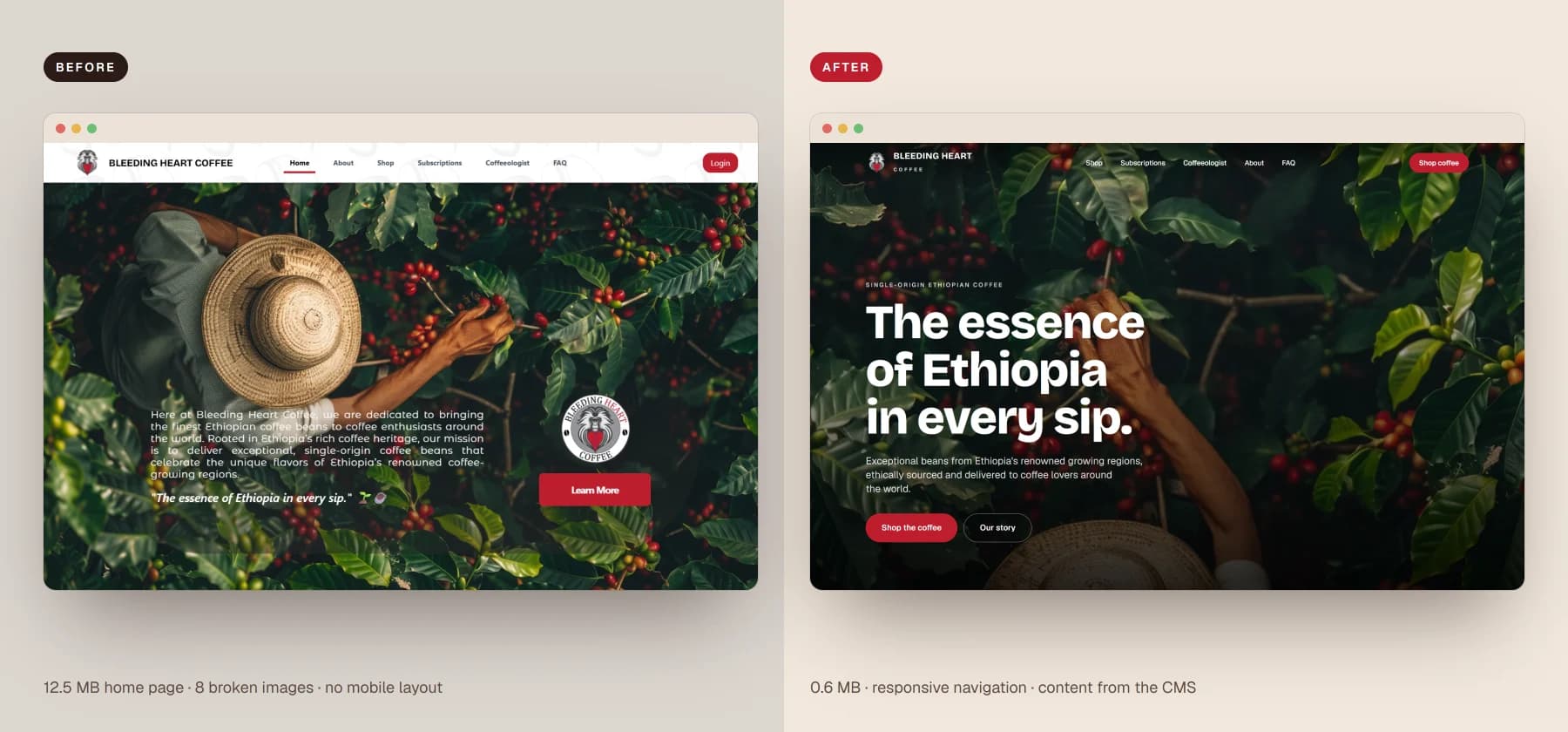
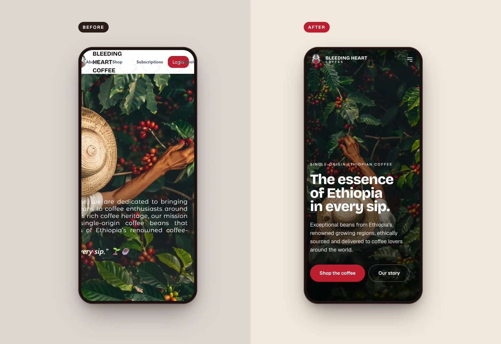
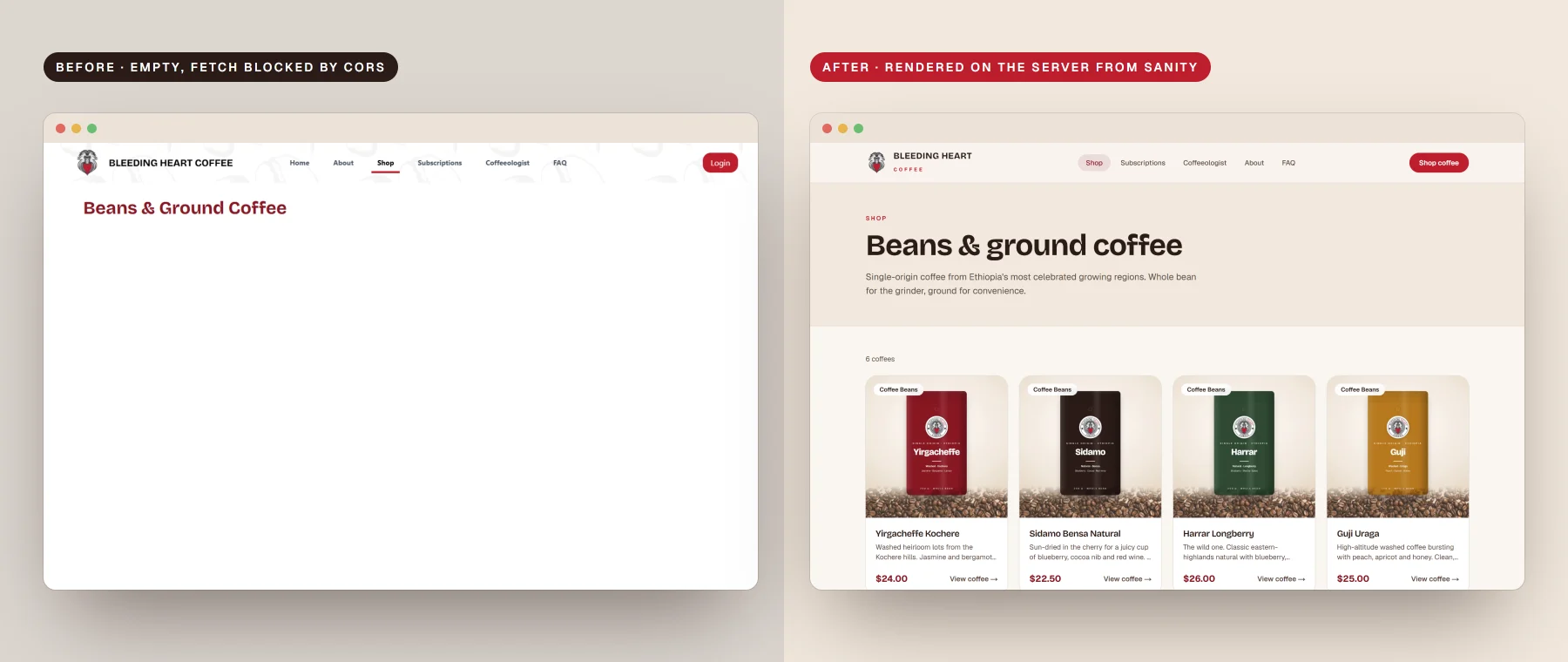
The brand had a memorable identity — a gelada baboon holding a red heart — but the first site looked good only on a large monitor. An audit of the live build found an empty shop, a 12 MB home page, a layout that broke on phones and half the navigation leading nowhere.

01

The shop was empty

Products failed to load in the browser, so visitors saw a heading and a blank page.

02

A 12 MB photo behind the hero

Oversized images skipped optimisation, and several pointed at files that didn't exist.

03

Broken on phones

A desktop-only header and a fixed-width slider pushed content off the screen.

04

Prices anyone could change

Product pages read the price from the link, and login, cart and newsletter did nothing.

Before → after

Original home page beside the redesign
The tagline becomes the headline, with two clear actions.
Original mobile home page beside the redesign
On phones, the overlapping header and cut-off hero are gone.
Empty original shop beside the redesigned shop
The shop now renders reliably, straight from the CMS.
← PreviousWhat we builtNext chapter →Screens